Production Company Font
We used a font that would look as if it would go with the horror film. This is because the production company help create the horror film and therefore it would be fitting. We feel that we achieved this theme in the font as it looks untidy and scary yet readable. We then made it blood red to fit with the theme again. JT
Blood making Font
We used the 28 Days Later font which, once again, gives the effect of a horror theme. It is also a red colour which helps with the blood theme. AT
Fonts for our titles
We used the same font for the titles throughout, it is relatively simple as we need it to be easy to read for the audience. As we have a limited time the text only stays up for a short time and this is also why it is vital to make it easy to read. AT
|
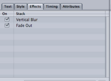
Here is the effects that we have put onto our titles. We used a vertical blur which makes them appear from the left, then the fade out makes them leave from the left as well. These effects come and go relatively quickly once again. AT
|
|
|
Here is the text that we have used for our opening titles. We used a white text on a black background. These are two contrasting colour's that makes it easy to read for the audience. AT
|
